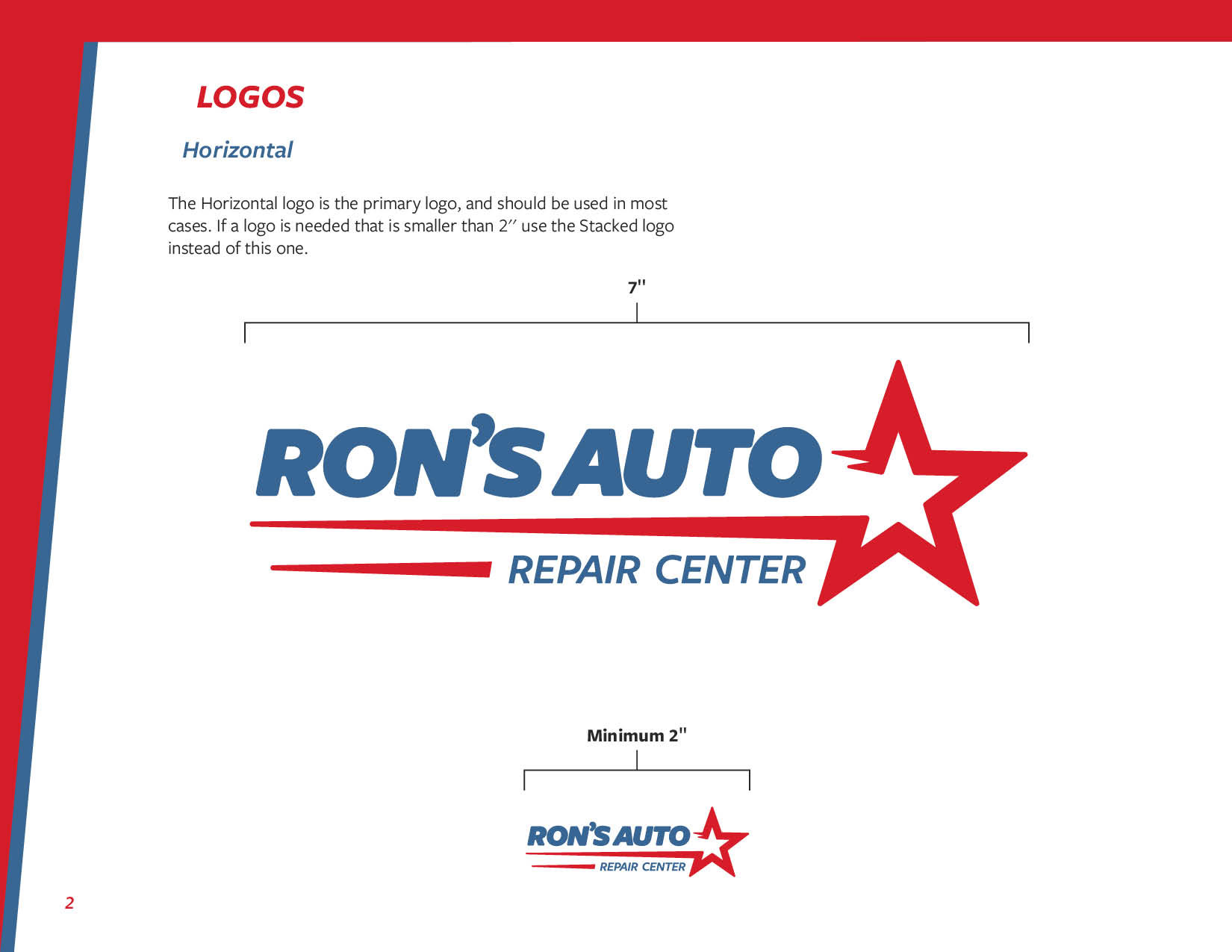
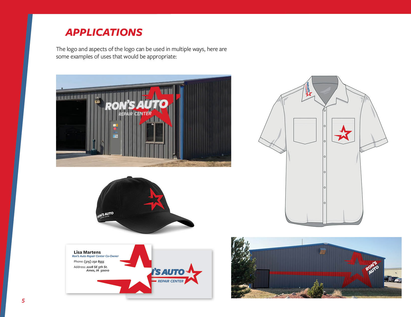
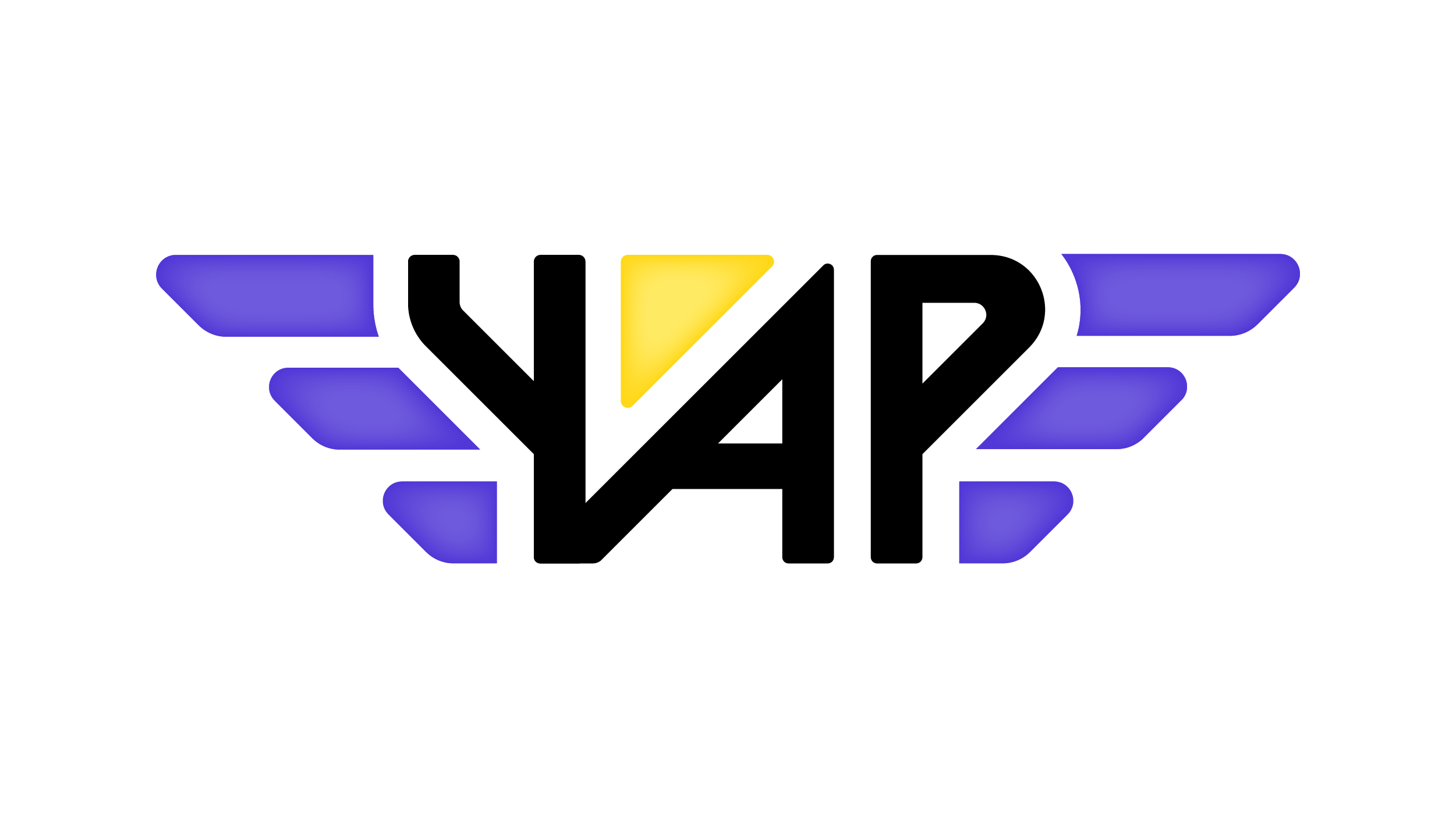
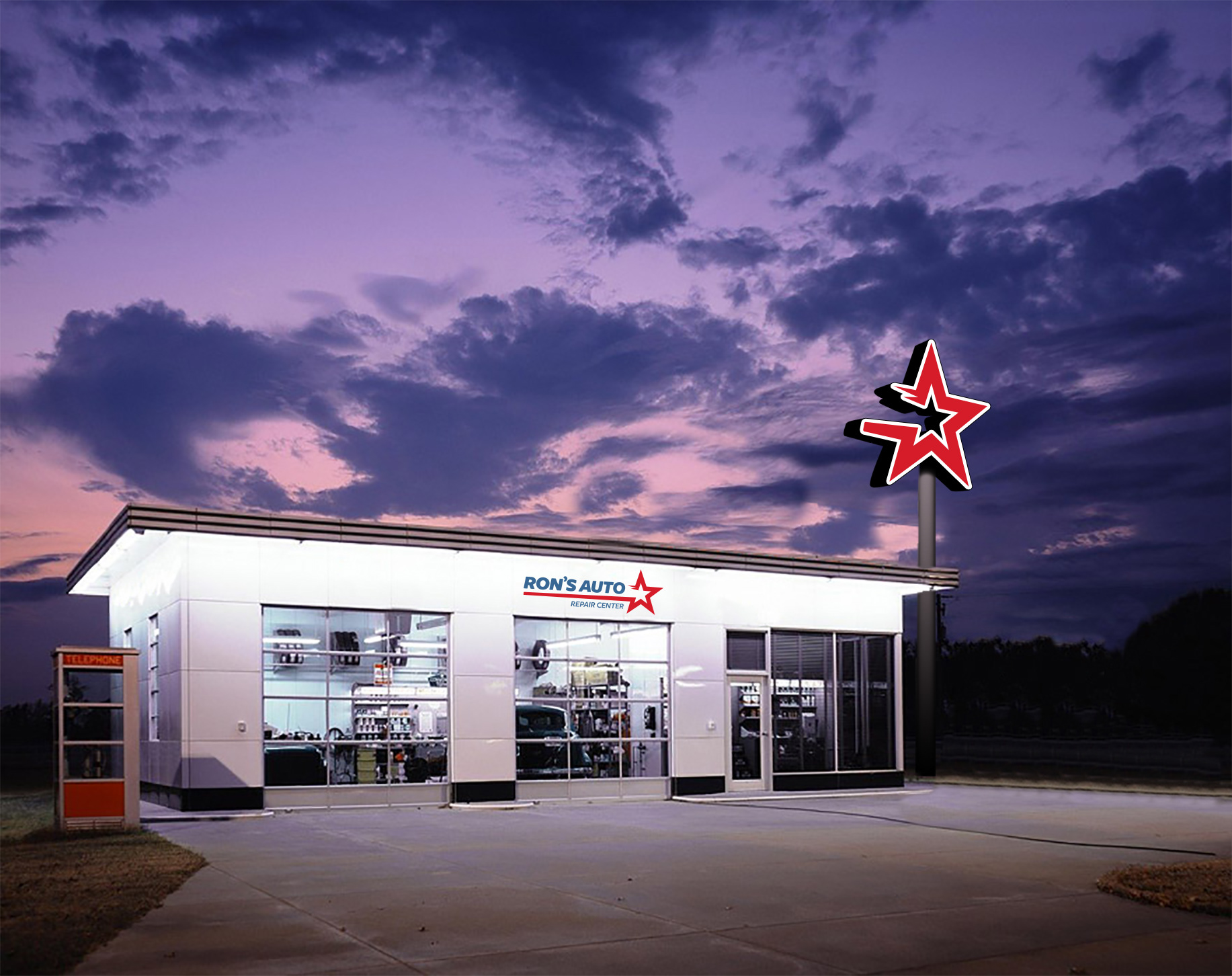
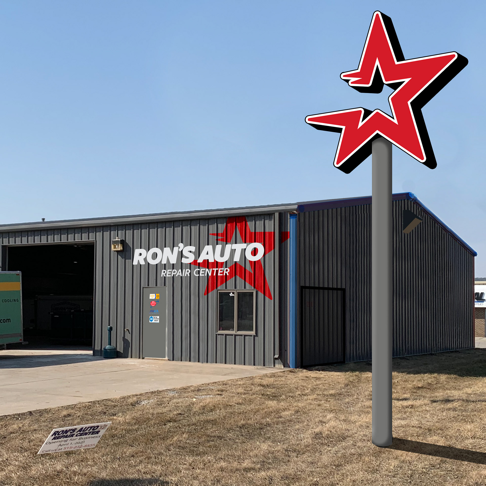
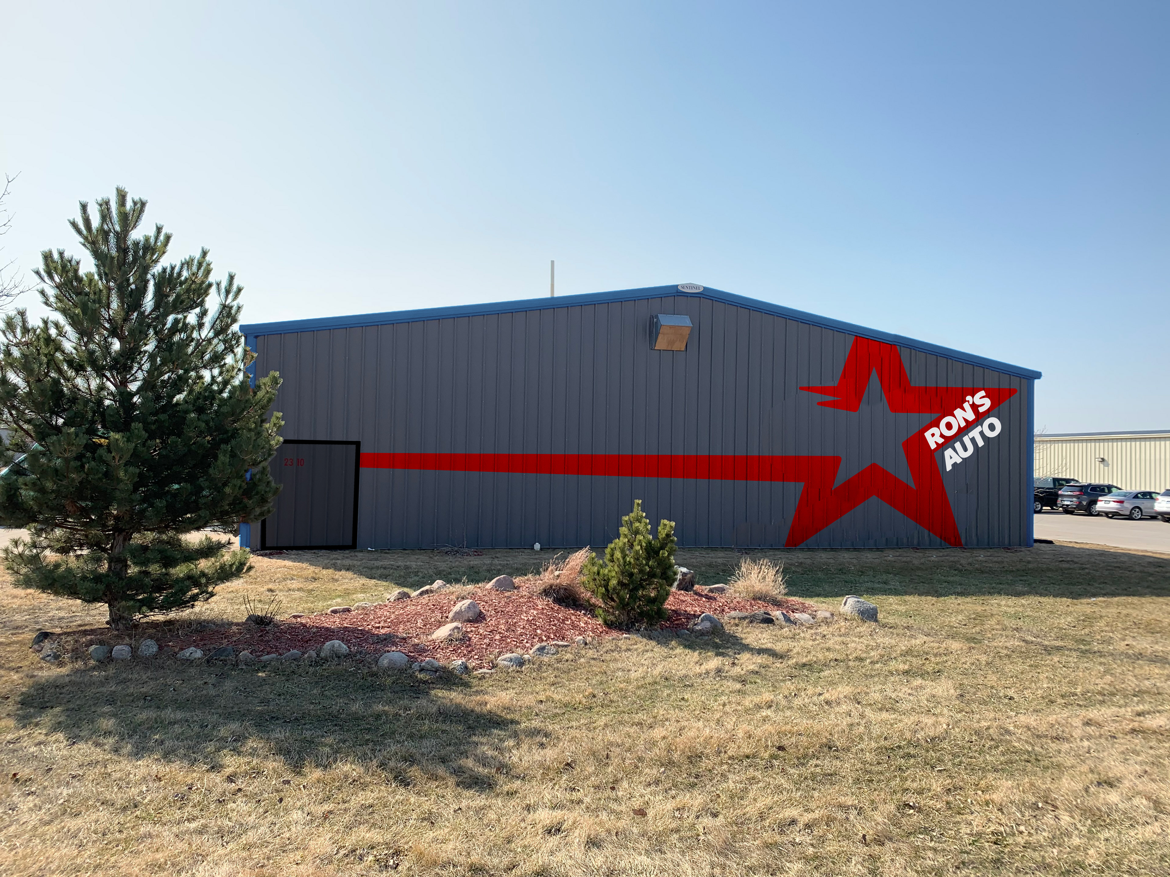
Final logo and a signage mockup at the new location.
Project Goal
Update the Ron's Auto brand to be more modern, while maintaining the feel of the original brand. This includes a new logo and new applications that would give client ideas on how to move forward with their brand.
Designers: Jay Meekins, Oni Wright, Tony Thrush | Creative Direction: Tony Thrush
Sketching
I started by looking at the current logo and deciding on two directions; one would be to take the brand in a more corporate friendly direction, while the other stayed a bit truer to the previous logo. The main goal that I had in mind however, was to not stray too far from the original look and feel, just adjusting and updating it.
Digitizing and Revisions
After picking a few to move forward with I moved to Illustrator. Through further ideation I eventually had 8 options for review. After several rounds of revisions within the company we sent three options to the client, who ended up moving forward with my option. Over the course of the next few weeks we refined the logo and began to think about applications.
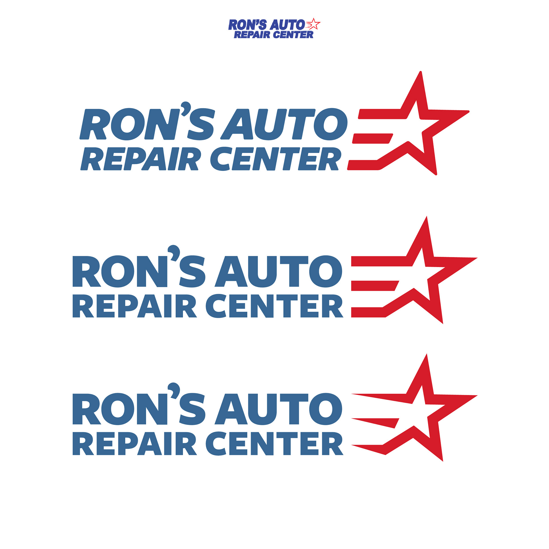
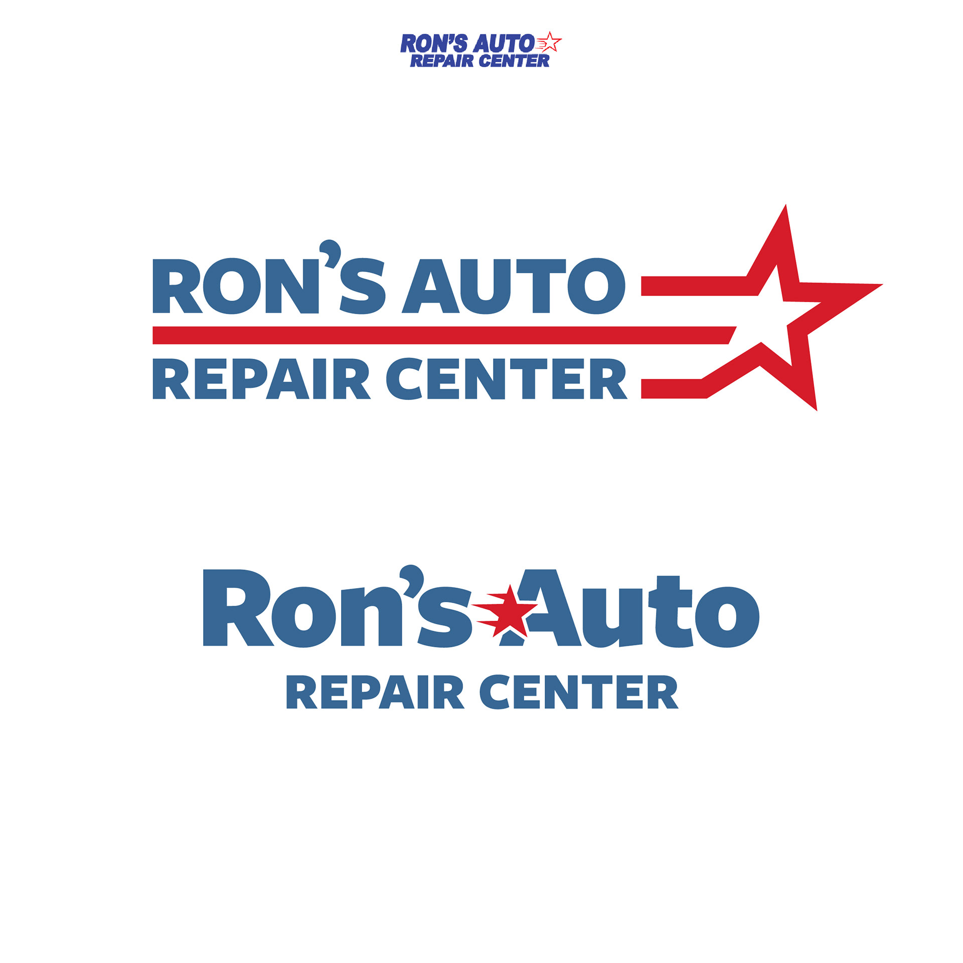
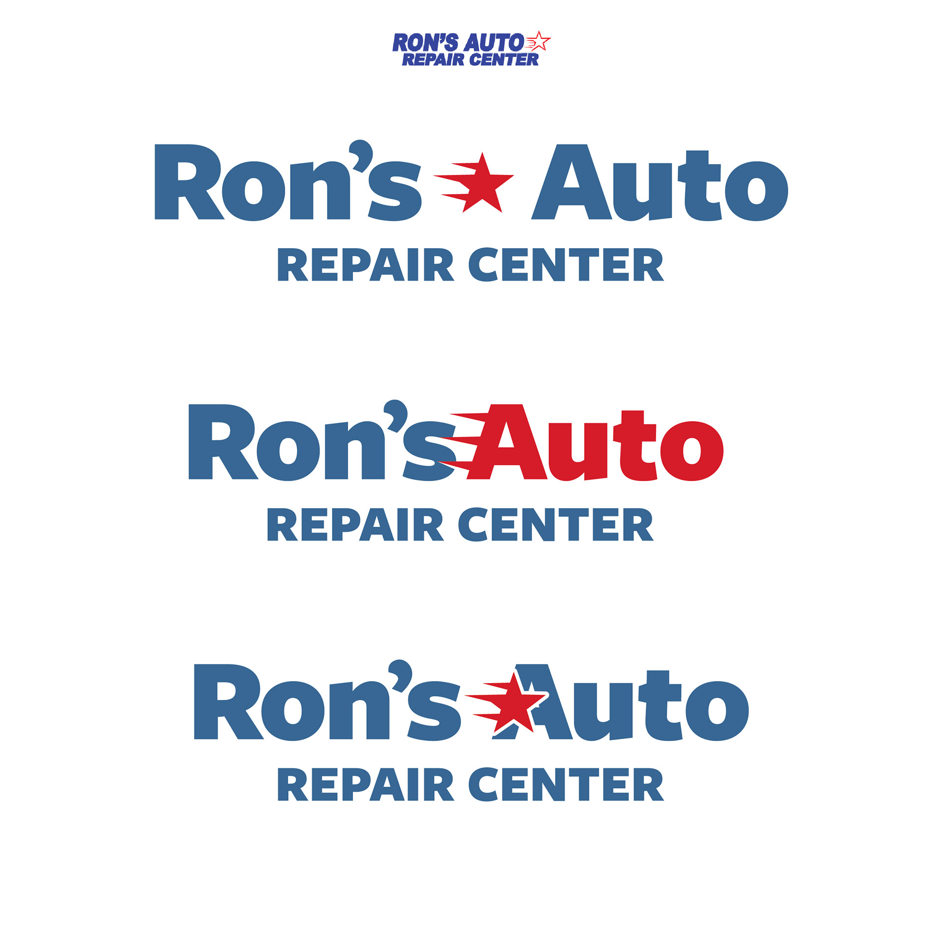
Final Logo
Mockups
Once we had the final logo, we created a few mockups for the client so they could get an idea of a few ways the logo could be used:
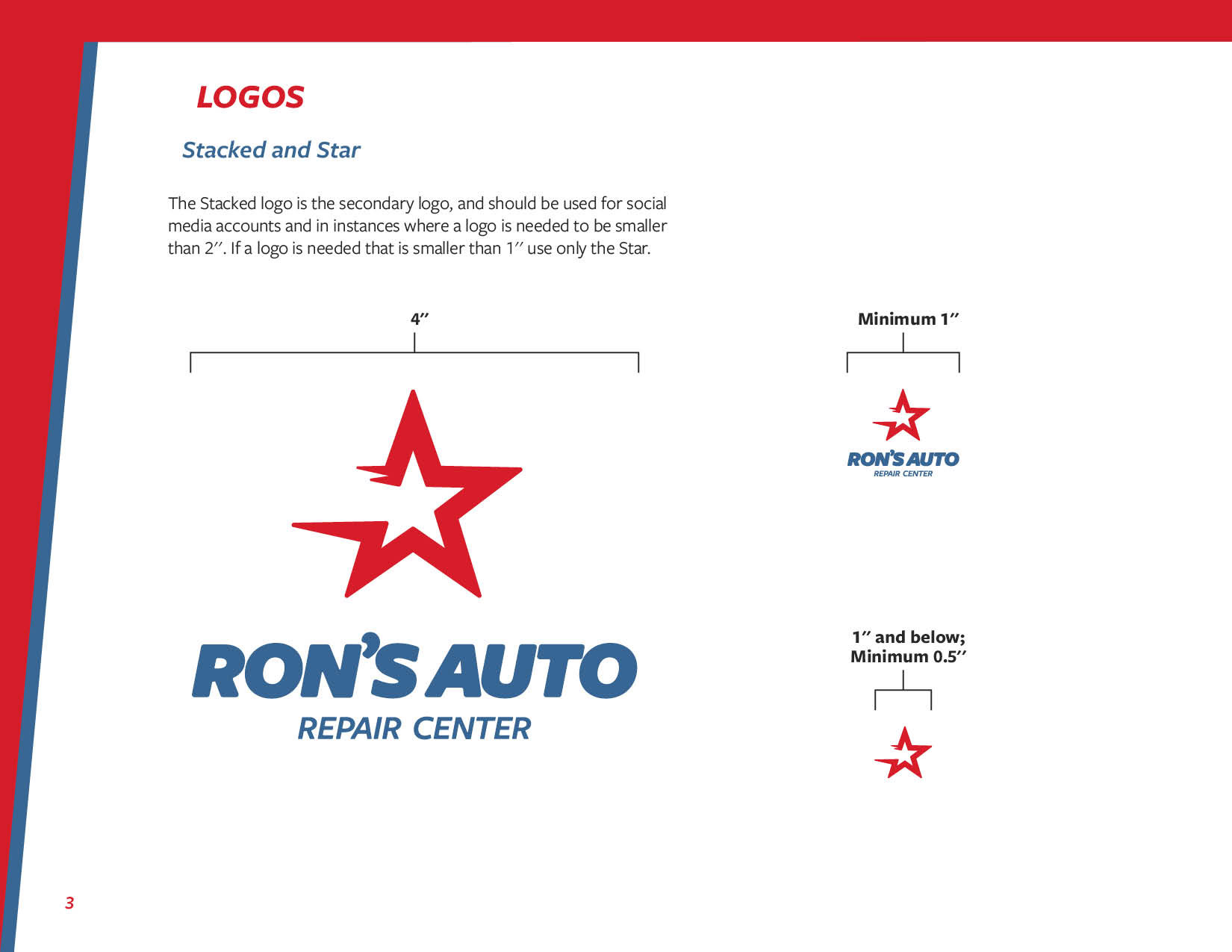
Style Guide Creation
After finalizing the logo, and the intended uses for the logo in terms of large scale graphics, I began working on the Style Guide. Here are a few pages from the document:
