Iteration
I began by researching the assets that the Youth Activity Profile was using and figured out what things I thought I could improve and what could be fully changed. Once I knew what direction I wanted to go, and discussing with my Creative Director, I began to sketch and work in Illustrator.
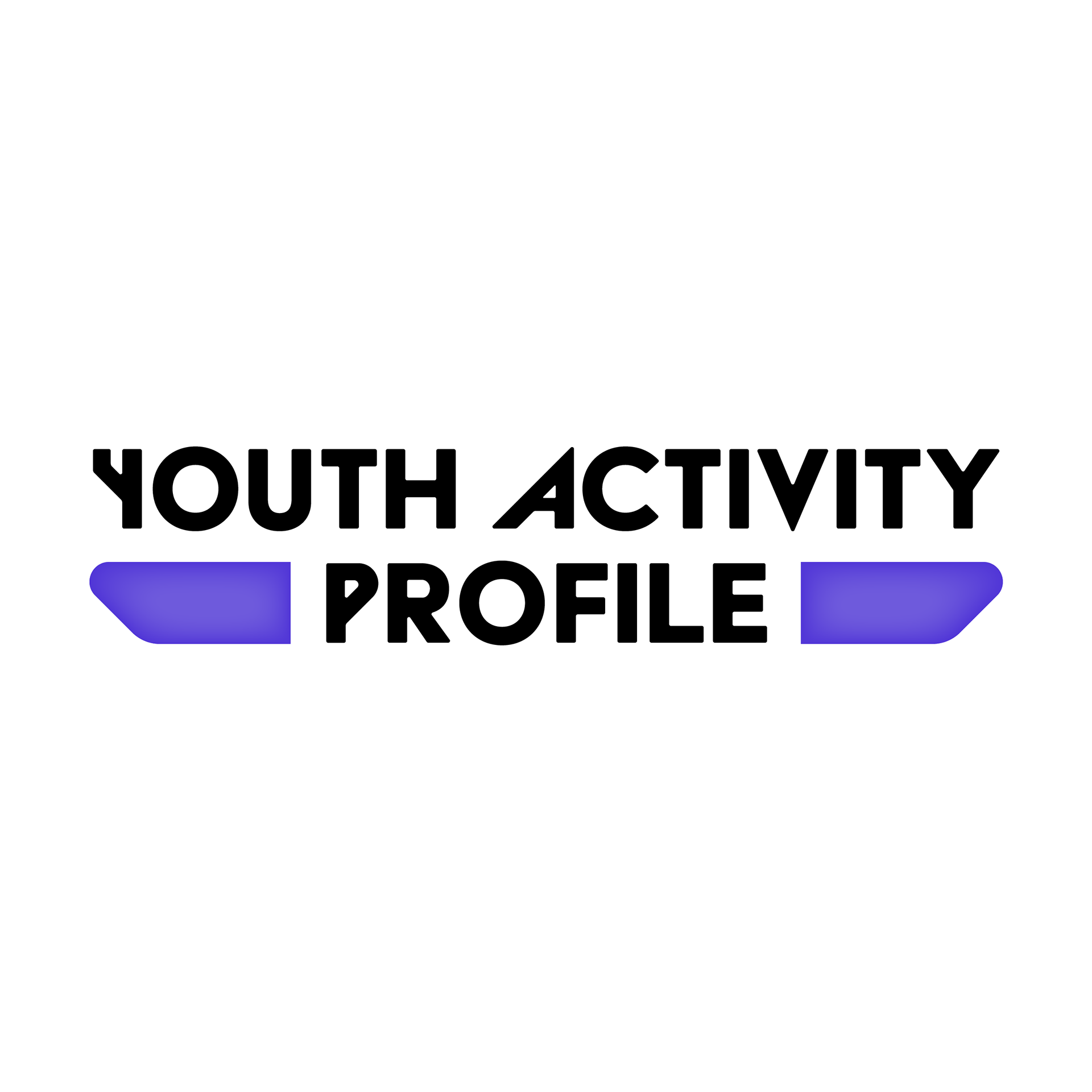
Round 1
The first option in this round was meant to update and clean up the exiting logo, the second option was my take on a more modern option for them, and the third was playing into the “youth” aspect of the name.

Round 2
In the second round we solidified the yellow and purple color palette, and began to expand on the icons used in the first option, and turn the second option into more of a badge. We also played with a more illustrative look and feel.
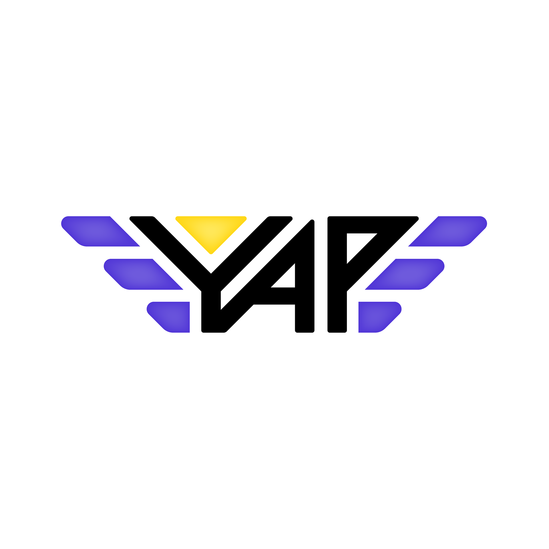
Round 3
In round three we moved forward with the badge concept fully, and after a few tweaks I started experimenting with the typography and the wings of the badge.

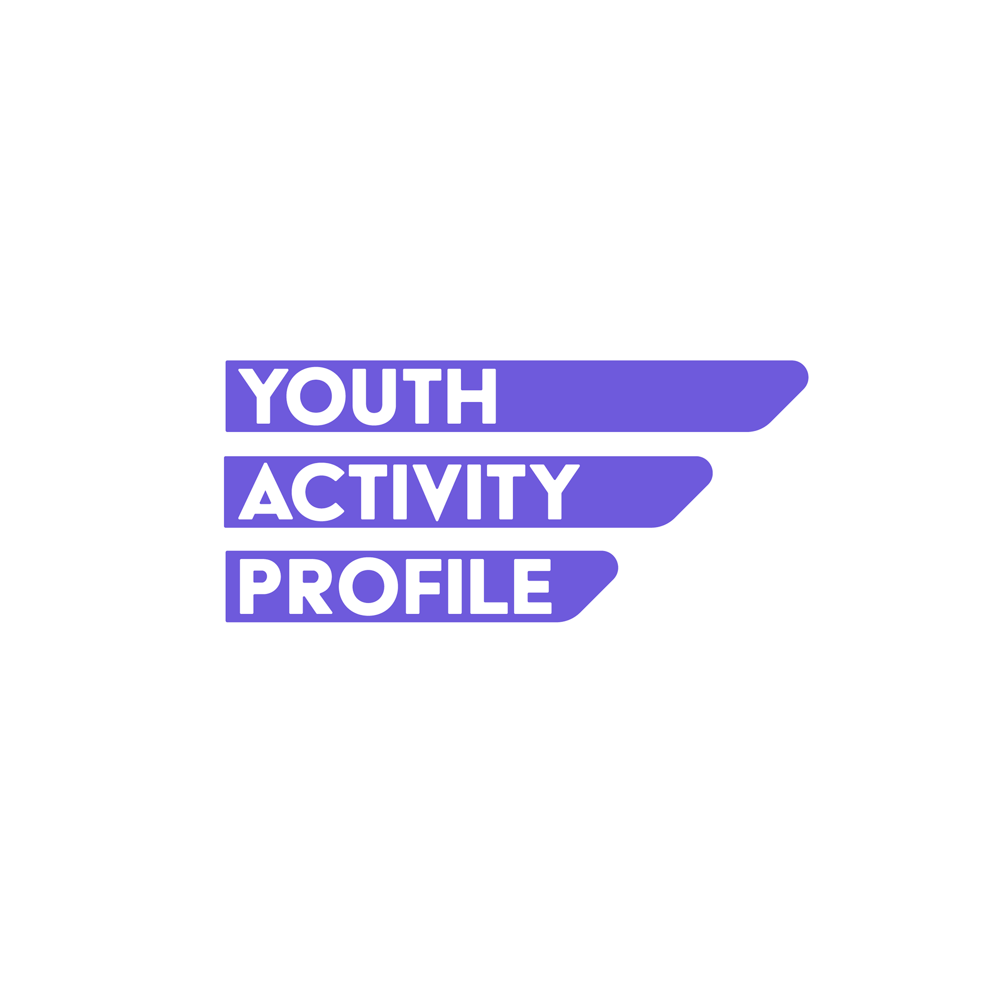
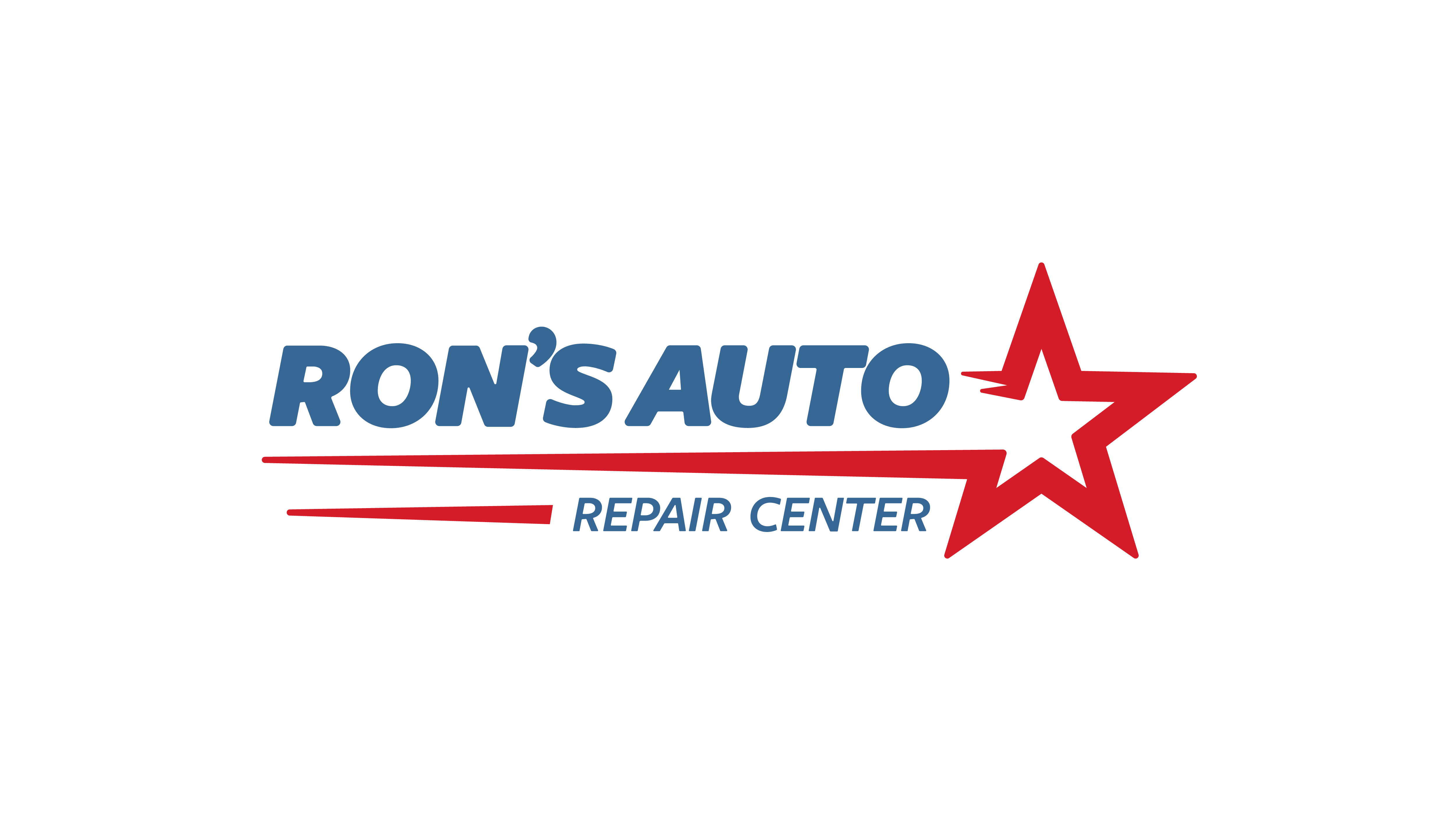
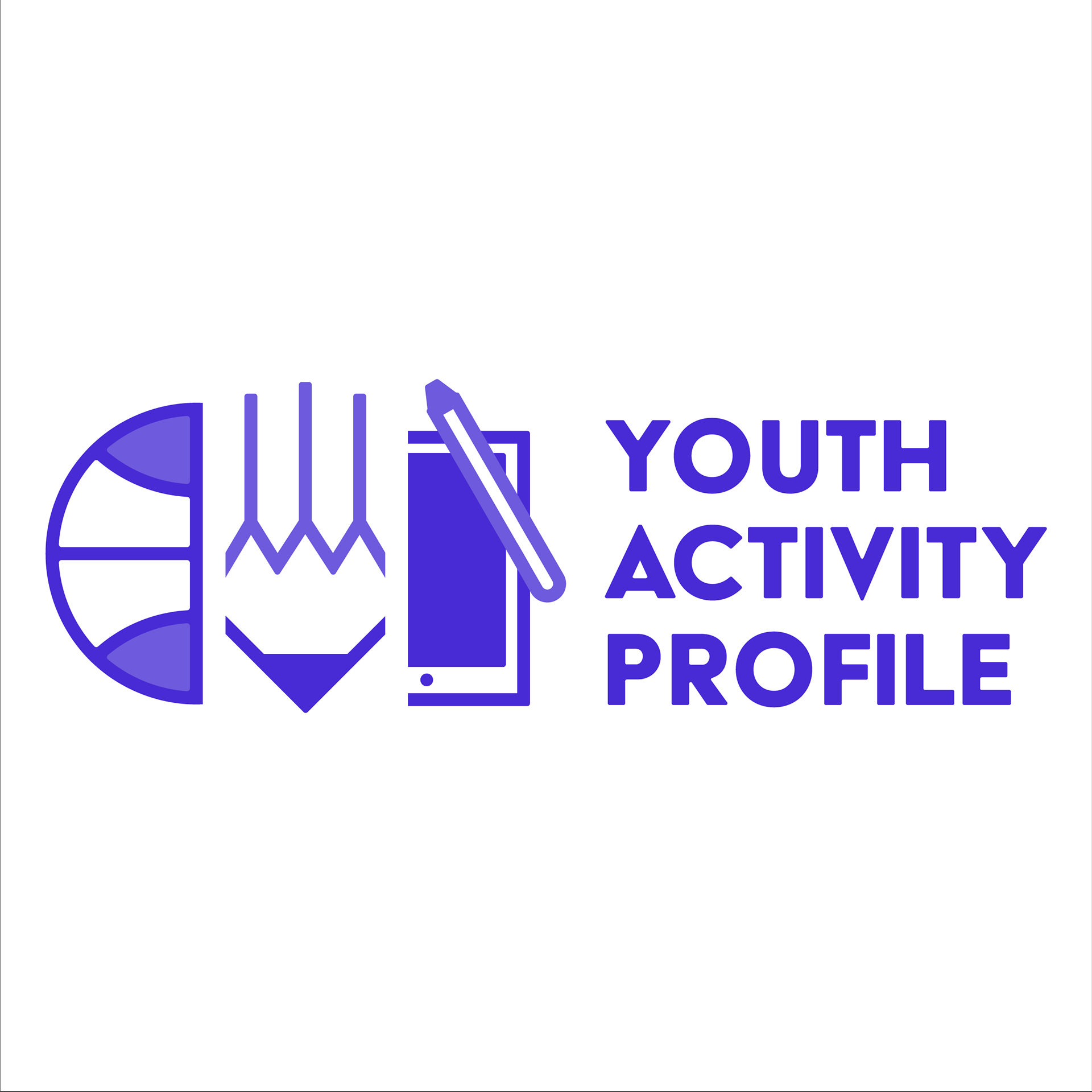
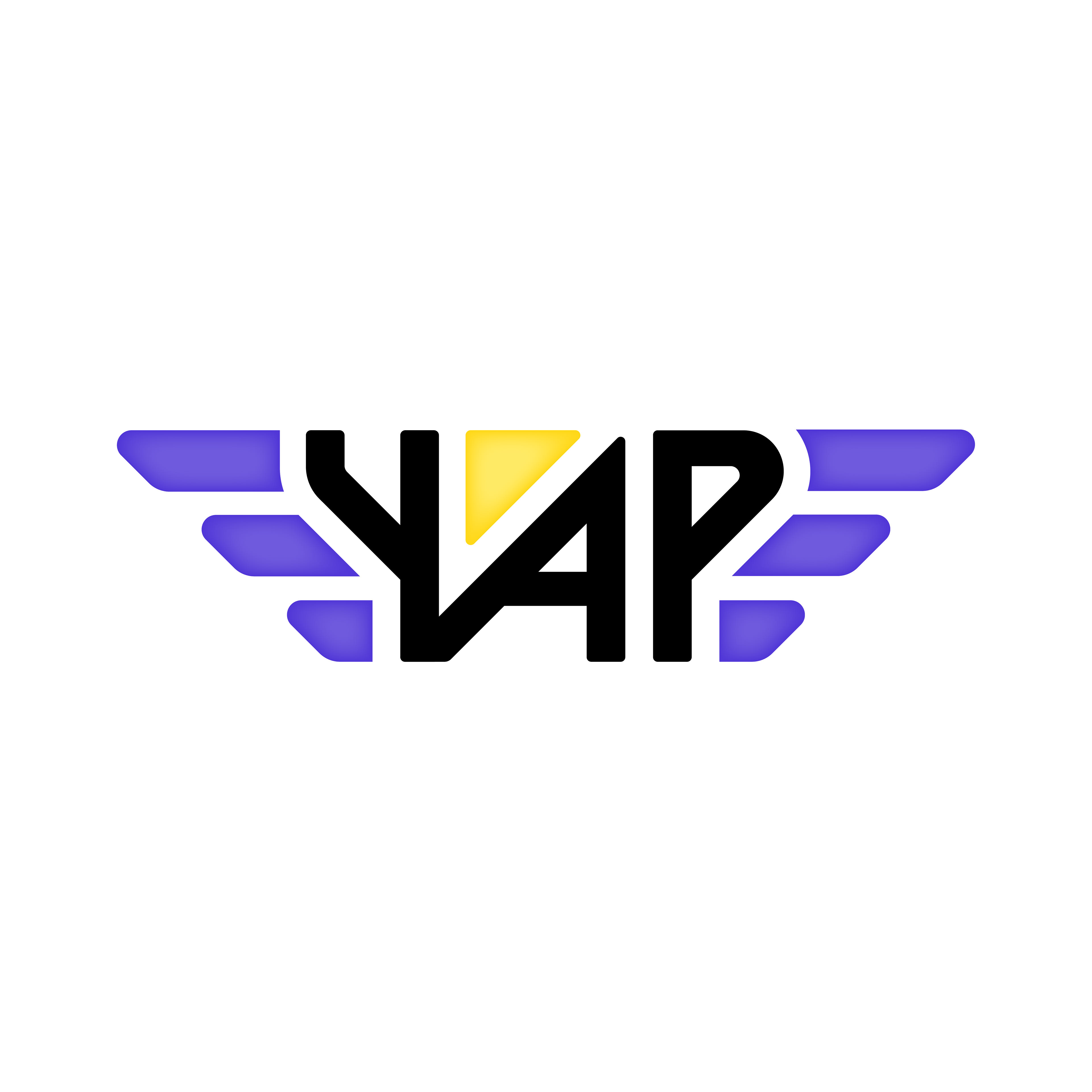
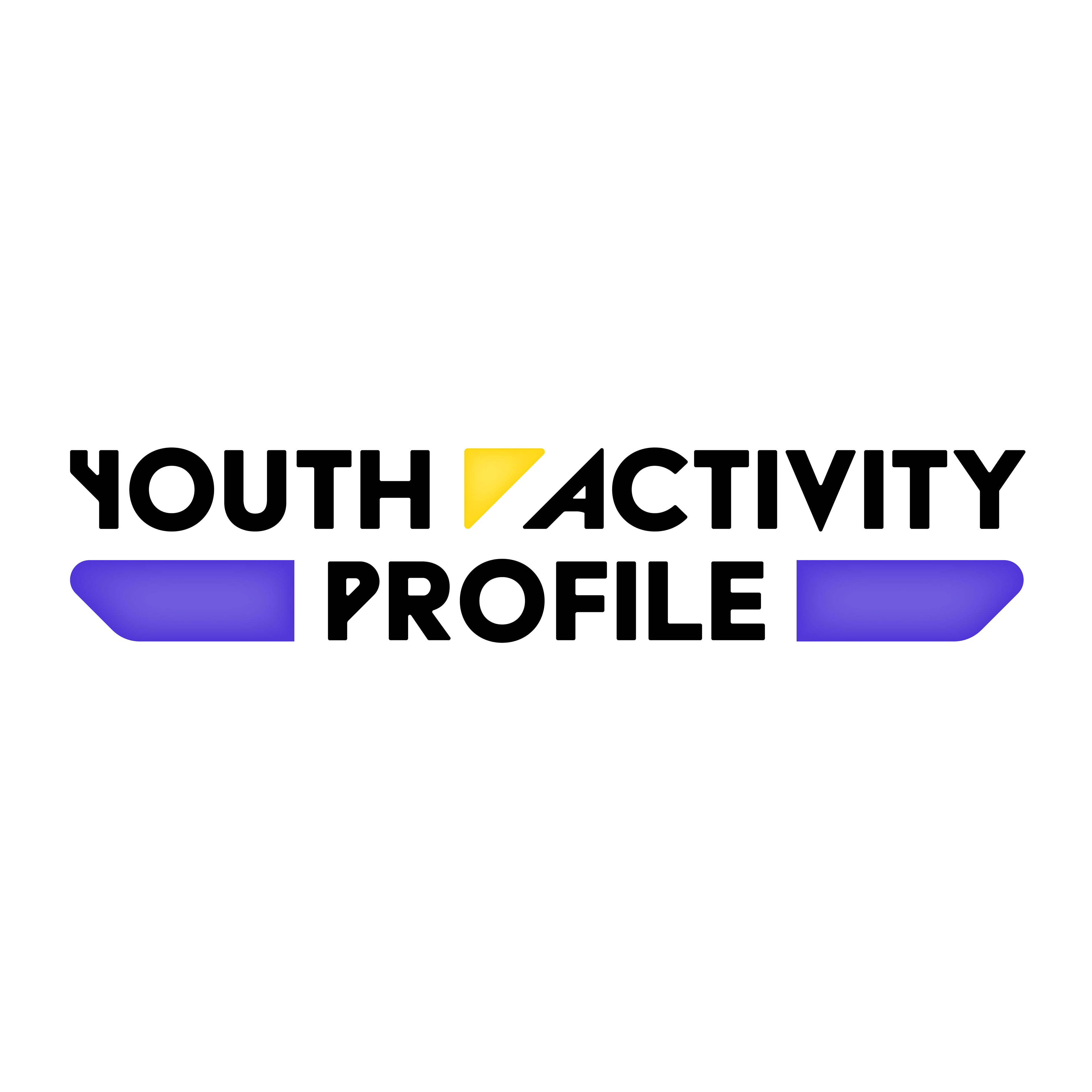
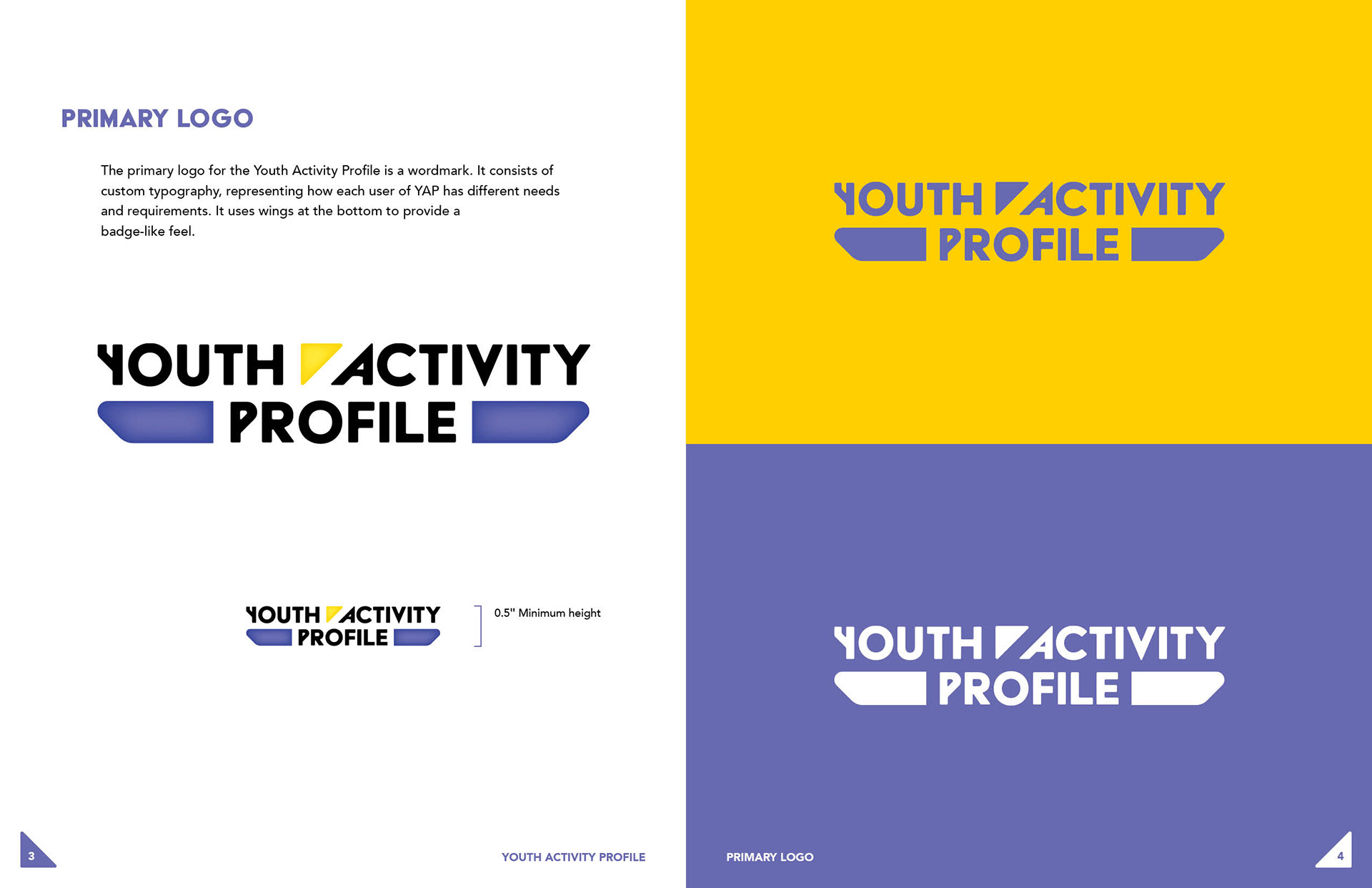
Final Logo
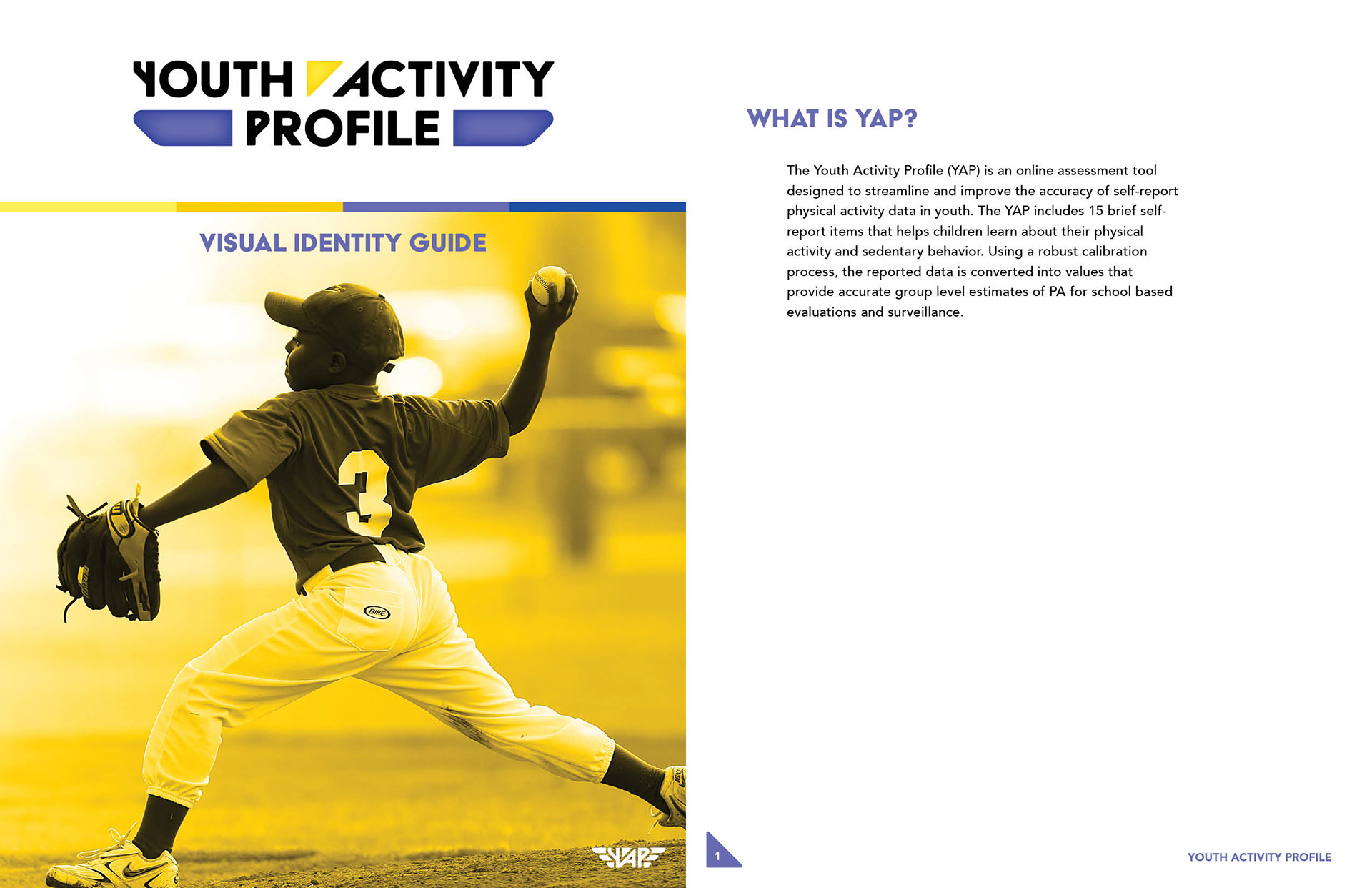
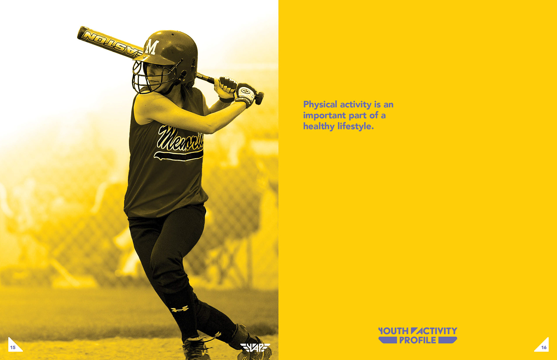
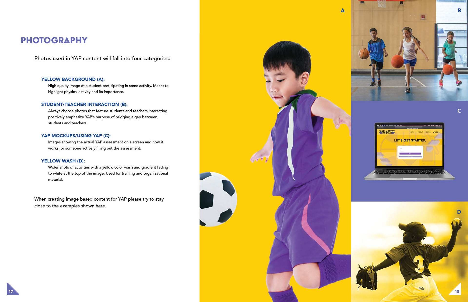
Style Guide Creation
Once the logo was finalized I began work on the style guide. Here are a few of the pages from the document:
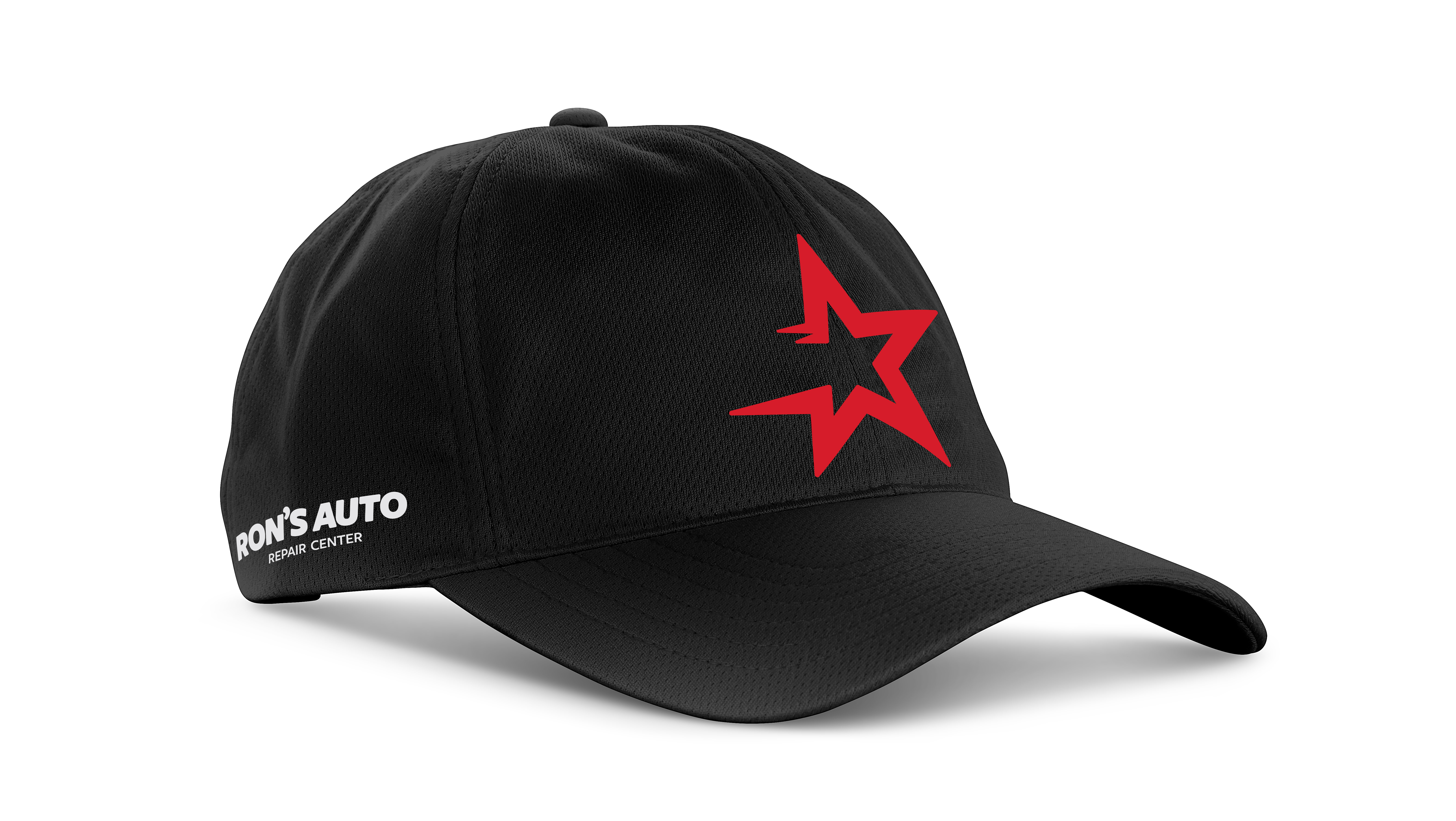
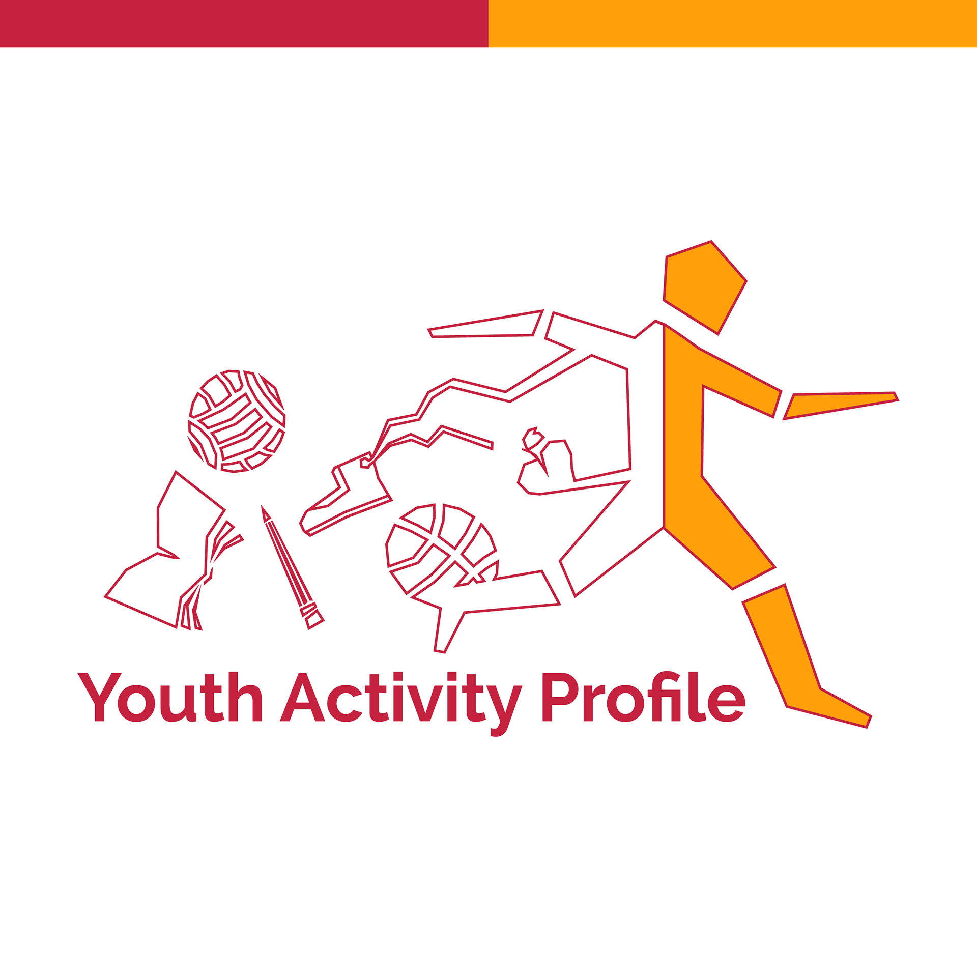
Mockups created by Talia Tory